Enter button doesn't work to search in GL Account Field and Resource Requirements space utilization
Answered
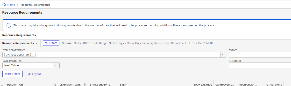
Description of the issue: Enter key does not work in the apply filter section from GL account also there is note saying “This page may take a long time to display results due to the amount of data that will need to be processed. Adding additional filters can speed up the process.” in resource requirement section which is taking more space
Business impact: More mouse clicks or tabs/Less screen space
Account name: Region: APAC
Client version: 25.1.9246.33146 (20250425)
Steps to reproduce: Go to GL account from main menu<Type 352 in the GL account filter and press enter. it doesn't work and need to click on apply filter
Go to resource requirement section from amin menu and we could see the message coming on first page
Observed results vs Expected results: Enter key does not work for apply filters although mentioned in the 25.2 improvement section- https://supportcenter.ungerboeck.com/hc/en-us/articles/29568572082071-What-s-New-in-the-New-UX-2024-4-2025-1-Updates#:~:text=Faster%20Actions%20with,WCAG%202.2%20standards.
Extra note is taking space in resource requirement page whereas there should be an option to remove it
Link to Zendesk ticket: Ticket: 2025.1 New UI - Resource Requirements – Momentus Support Center – Zendesk
Ticket: 2025.1 New UI - Enter button doesn't… – Momentus Support Center – Zendesk
Link to Debug site: https://supportwebap.ungerboeck.com/ICCSydney_Prod_0472290862_USI_V30/app85.cshtml?ReturnUrl=%2fICCSydney_Prod_0472290862_USI_V30#/about?data=a9eb61bb884898477b8b0e78966baa20fc4e
Environment : Production
-

CC @...
-

Carissa Harrison @...
Enter key not working on drop down filters seems to be a global new UI issue. See Events list and put your cursor into any drop down and press “Enter”. This does not trigger the load of the list.
The message on the top - we should look at how to make this fade away or re-work for new UI when we want to display a warning message like this on the load of the window. Would be interested in UX opinion on how we should do this. See message in screenshot below
-

Divya Thakur Please see the bolded text found in https://supportcenter.ungerboeck.com/hc/en-us/articles/29568572082071-What-s-New-in-the-New-UX-2024-4-2025-1-Updates
Faster Actions with ENTER Key Support-
What: Pressing ENTER now triggers the primary action in forms, modals, drawers, and routed pages—helping you submit forms, apply filters, and confirm actions without extra clicks. This excludes fields like search boxes, combo boxes, and rich text editors where ENTER already has a defined function.
- Context-Aware Behavior: ENTER does not override native actions for Search fields, Combo boxes, and Rich text editors.
- Specific Use Cases:
o Pressing ENTER in a filter modal applies filters and closes the modal.
o ENTER on a routed page triggers Apply Changes.
o ENTER in a drawer, modal, or confirmation prompt activates the primary button.
- Why: This update improves speed, efficiency, and accessibility, making workflows more intuitive and fully compliant with WCAG 2.2 standards.
Item Department field and Event field are drop lists and ENTER is used to select open the drop list or select the highlighted value in the list. The ENTER key's functionality is over written in this case.
Both of these inquires are working as designed. Please submit product feedback for these requests and paste the links here.
Thanks, -
What: Pressing ENTER now triggers the primary action in forms, modals, drawers, and routed pages—helping you submit forms, apply filters, and confirm actions without extra clicks. This excludes fields like search boxes, combo boxes, and rich text editors where ENTER already has a defined function.
-

Ryan Ungerboeck For the message / alert on the page, we have variations of this design component where we can include an ‘X’ to close the alert if necessary in certain scenarios. It would need to be specifically noted as an exception, since in most scenarios we don't want to hide the alerts until a user resolves a problem, and even informational ones should usually persist. Not sure if it makes sense to always have that alert there, unless it was something that was a “just in case” warning for users.
Either way, if you want for that specific message, you can use the following style from our component library:

Please sign in to leave a comment.
Comments
4 comments
Date Votes