Inconsistent button locations in new UI
Answered
- Description of the issue
1 - "Save" and "Apply Changes" buttons
In image 1 below, you will see in the “Add Service Order Items” field, that the “Save” (in red) is too the far right and “Apply Changes” (in green) is on the left of “Save”.
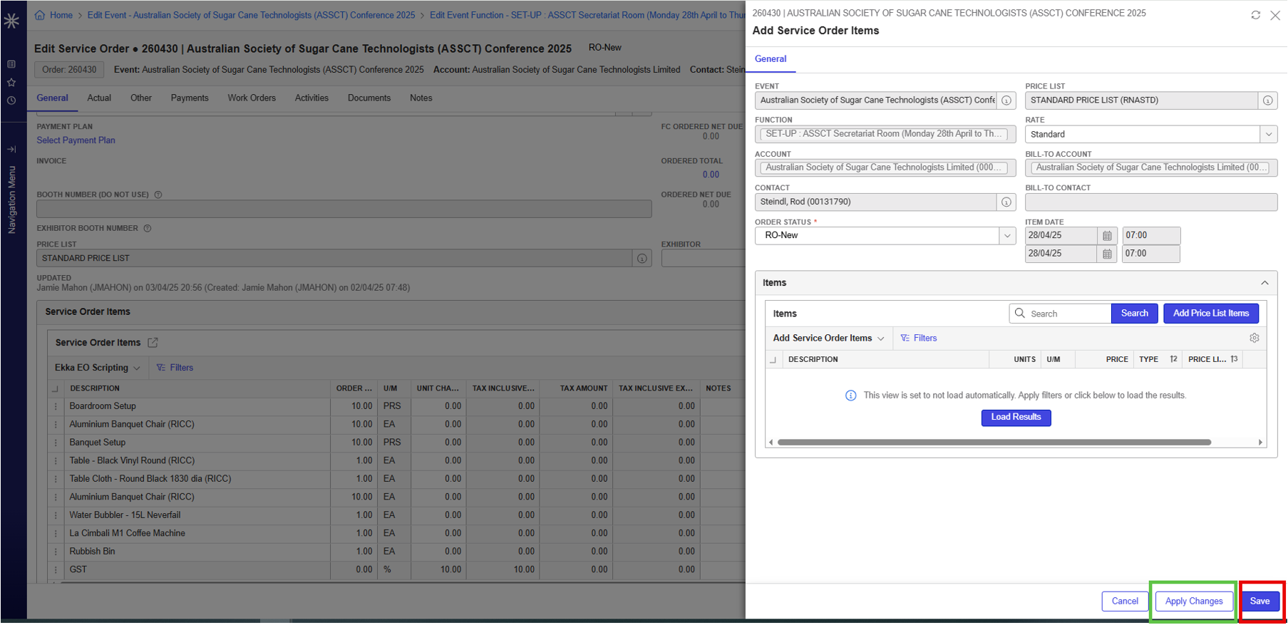
In image 2 further below, you will see in the “Edit Note - Order Item / Order” field, that the “Apply Changes” (in green) is on the far right and “Save” (in red) is on the lefthand side of “Apply Changes”.

This should be changed to reflect consistency. It results in errors which causes frustration with the process.
- Account name: Royal National Agriculture
- Region: APAC
-
Client version:
25.12025040301 - Business impact if not resolved: Creating system inefficiencies and criticism/dislike of the system.
- Link to Zendesk ticket: Ticket: Inconsistent button locations in new… – Momentus Support Center – Zendesk
- Local v30 URL: https://supportwebap.ungerboeck.com/RNA_Prod_0221395346_USI_V30
-

Divya Thakur this is answered on the F&Q Page
Why aren’t the save buttons consistent between drawers and pages?Save behavior is standardized based on context:
- Drawers/Modals: The primary save action always closes the drawer or modal, since they’re intended for quick, focused tasks.
- Pages: The primary action is Apply Changes, allowing users to save progress without navigating away. Based on customer feedback, this improves flow during complex or multi-step updates.
You can update data across tabs without saving after each one. If saving is required before leaving a tab, a prompt will notify you.
https://supportcenter.ungerboeck.com/hc/en-us/articles/31176805545367-Enterprise-New-UX-FAQs

Please sign in to leave a comment.
Comments
2 comments
Date Votes